In a challenging retail environment, shopping centres and stores are pulling out the stops to grab whatever customer dollars they can before they are spent online. But that means being smart about how they showcase their wares. By Carla Gutierrez
For a city famed for its food and retail overload, Singapore has always banked on the desire of the local and tourist dollars to keep the lights on in the stores. As the economy wobbles and the online space proves more attractive, retailers are keen to make customers stay longer at physical stores and hopefully spend more than they bargained on.
Three different retailers and their visual merchandisers give us insights into how they set the stage for customer conquests.
Engaging Spaces
One of the most critical aspects of designing a store is to create a welcoming and engaging space to entice the consumer to come in. From the moment you step in, the layout from front to back will impact how you engage with the brand.
Another challenge is striking the balance between creating an aesthetically pleasing enviroment and making efficient use of space.
Michelle McEwen, the Group Communications Manager of SPACE Furniture says that their designs are made to reflect lived-in environments to serve as inspiration for clients.
“Settings are complemented with accessories, wallpaper, floor covering, art pieces, background music right down to the scent, providing a multi-sensory shopping experience,” she explains.
Tapping into more than just sight helps the consumer picture the displays as they would in their own intended spaces, subtly helping them to make a purchase.

Convenience Or Discovery?
Depending on the type of store, the layout could either be built for practicality or for exploration. For Cotton On, effectiveness and innovation are key factors.
“Consumers are well educated, savvy and have growing expectations around their in-store experience,” says Jonathon Long, General Manager of Design and Delivery at Cotton On group.
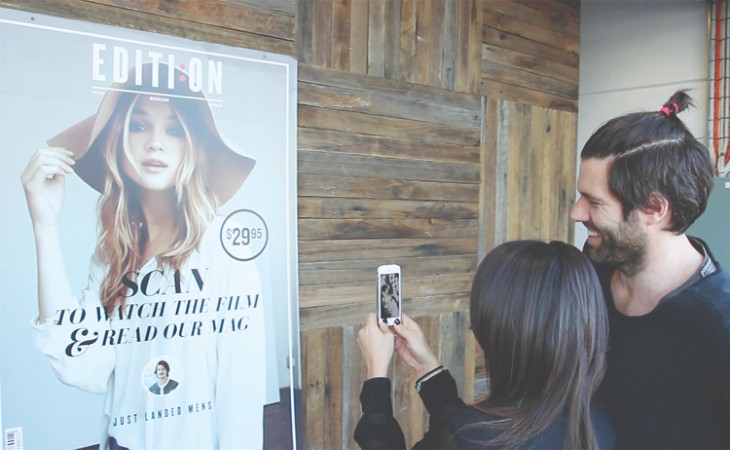
An example of their innovations can be found in Australia, where some outlets have begun offering free wi-fi and charging stations for their mobile devices.
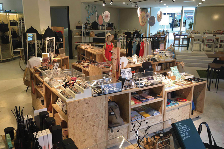
For luxury brands, it could be another story altogether. Kapok, which sells fashion and accessories, has designed its store to encourage a discovery experience, like a treasure hunt, combined with an open style design to make customers feel comfortable.
“We regularly reinvent and renovate our stores to maintain its freshness for our customers. We do display rotation or put new arrivals near the front of the store, for example,” said Cherry Chiu, Assistant Marketing Manager of Kapok.

Constant Reinvention
According to Chiu, the colour red is regularly used during sales periods to catch the customer’s eye and to increase the motivation to shop. The colour triggers a reaction in the potential customer to check out what’s on offer, and, if the price is right, feel satisfied to make their purchases for a bargain.
Both McEwen and Chi explain that their brand’s visual merchandisers use a strong mix of colours throughout their stores. For Kapok, blue and green to provide a calm and peaceful aura to the customers, while for SPACE, it depends on the showcase.
“As you move through SPACE, the mood changes to reflect the different types of settings we display from the brands we represent,” says McEwen.
Across the board, all three retailers agreed that constant reinvention was vital to keep customers coming back. With perfectly timed redecoration of the spaces, they not only bring back familiar faces, but also entice new ones to come in.
This space has to be dynamic, never static.


